For most businesses, understanding who is visiting their website and how they’re using it is important. Using analytics can help you improve your site, learn about visitors, plan marketing campaigns, and track campaign success.
Although may host providers offer metric trackers, they are not always easy to use and are often filled with unwanted information. (But, they are sometimes more accurate). Many website owners and their developers have opted for Google Analytics as an alternative.
Even though Google Analytics has a nicer interface, many people don’t know what all that information means. This post is designed to help Google Analytics users understand what they are seeing in the reports, without going too deep into the functionalities of Google’s system. This blog post focuses on the Google Analytics home page. Furture posts will focus on the detailed reports.
The Google Analytics Interface
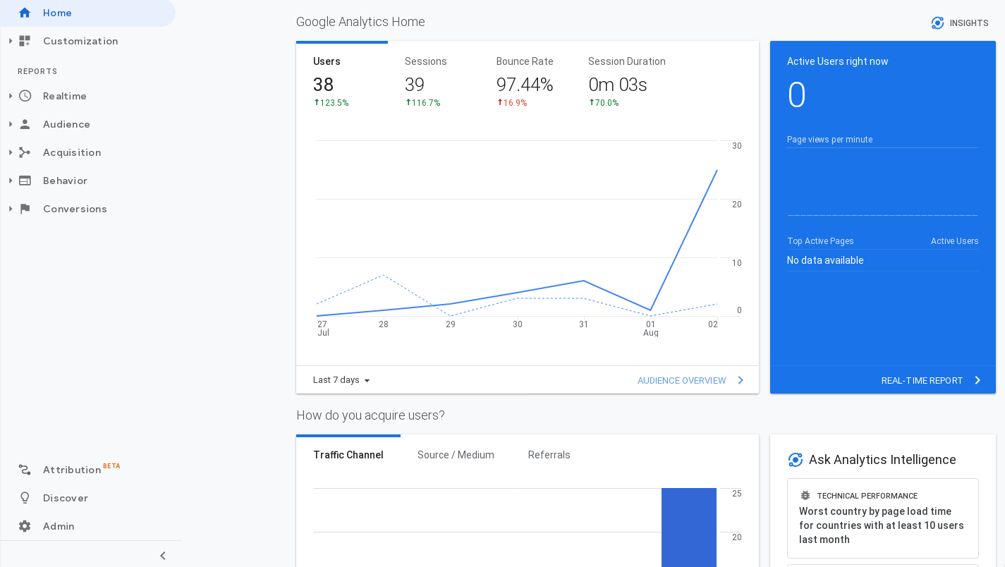
Refer to Figure 1, below.
- Search (not in image) – use this to quickly find reports, help document.
- (A) Customization – Set up your own report dashboard, custom reports, and more.
- (B) Discover – read up on Google Analytics and its suite of tools.
- (C) Admin – Access your Google Analytics account.
The Reports Menu Items
- (D) Realtime – see how your audience is interacting with your website in real-time. Find out they’re location, what content they are viewing and more.
- (E) Audience – learn about your audience – their demographic info, how they engage with your content, and what devices they use to access your website.
- (F) Acquisition – find out where your traffic is coming from (not location). How are visitors reaching your site and how each traffic source is behaving on your website.
- (G) Behavior – learn how people behave and move around your website. View data on page views, bounce rate, time spend on pages/site, etc.
- (H) Conversions – this lets you track specific actions that your visitors take and how effectively your website gets people to take those actions.
Google Analytics Home - Main Graph
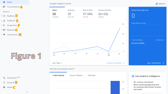
Refer to Figure 2, below.
This is a basic look at how your website is doing – home many people are visiting and how long their staying. At the bottom, left of the graph, you can choose the period you’d like the graph to display. By default it is the last seven days. But, you can choose options like: today, yesterday, last 90 days, etc.
The graph shows the following:
- Users - the number of unique visitors. Multiple visits to your site by the same user in a given period of time are counted as a single visit.
- Sessions – how many visits users make to your site – one user can visit multiple times. When this happens, the ‘users’ number does not increase, but the ‘sessions’ number does. This number will always be equal to or greater than the users number.
- Bounce Rate – how many visitors leave your site without visiting a second page.
- Session Duration – this is an average of how long a visitor stays on your site.
Traffic Report
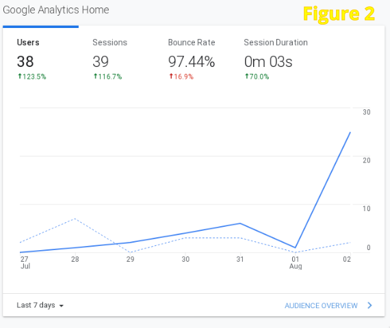
Refer to Figure 3, below.
This graph give you a picture of where your traffic is from (not location). This information may be useful in planning your marketing strategy, seeing how well that strategy is working, or tracking a social media campaign.
This graph may show traffic from any of the following channels:
- Organic Search – this is traffic from search engines. The visitor entered a key word or phrase and your site was in the results. This is not from ads that may appear on search engine pages.
- Referral – traffic that comes to your site from a direct link on another site. Occasionally you may see a social media site listed here too.
- Social – this number reflects those coming from social media pages. This might be from a status post, a link from a profile page, etc.
- Direct – the visitors either typed your web address in their browser or have your site bookmarked and used that bookmark.
- Other – any traffic from somewhere other than the above.
Audience Report
Refer to Figure 4, below.
There are three graphs as part of this report. These graphs are pretty self-explanatory:
- Users by time of day – this shows the number of visitors to your site on each day of the week and each hour of the day.
- Sessions by country – this shows the country of origin for your visitors, listed in order of most visitors (by percentage).
- Sessions by device – the type of device your visitors are using when accessing your website. The possibilities are desktop, mobile, tablet. This graph shows your the percentage of users on each device and the trend for the period.
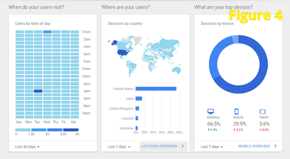
Each of these graphs can be changed to display results over different time periods. Use the dropdown in the bottom, left of each graph to change the period.
This information can be useful in understanding your audience and understanding how you might tailor your site and activities to best reach the audience that is using the site. For example, you may want to publish blog posts just prior to the high traffic days/hours - when you are expecting the most visitors.
You may also want to alter your site to make sure it performs well on the device that visitors are most using to access your website.
Pages Visited
Refer to Figure 5, below.
This list shows the pages that are visited the most by your users. This information may be useful for several reasons.
You might want to see how many visitors proceed through your site to the cart, checkout, and ‘thank you’ pages. If the cart and checkout pages have good numbers, but the ‘thank you’ page’s numbers are low, customers may not trust your checkout process or card processor.
The information here can be used to see how many visitors are hitting special landing pages included in ads or social media posts.
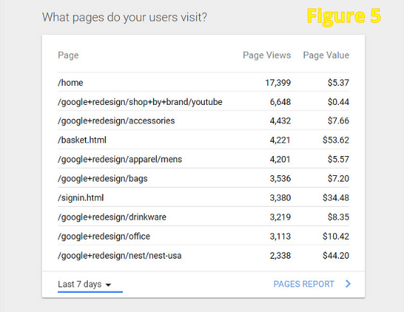
The ‘page value’ column in this table is outside the scope of this blog post.
Terminology Infographic
You may find the following infographic helpful. Feel free to download the PDF version (link below image).
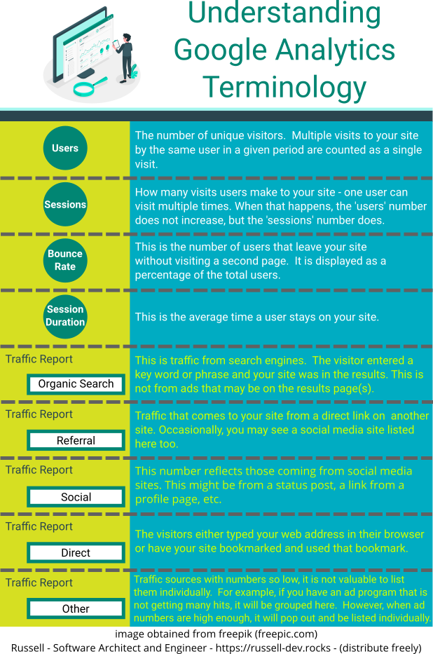
You can download this infographic in PDF format here.
In the next blog post on Google Analytics, I will look at each of the reports more in-depth.
